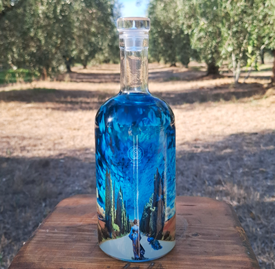
In the world of premium spirits — where the number of products keeps growing and competition often plays out in the few seconds before a purchase decision — packaging takes on an increasingly strategic role. This is the context for the Peacock Gin project, which originated from the graphic design and original illustrations created by Elena Maria Aiello (Ascolta Visioni), subsequently translated onto the bottle through technical and production development managed by P&P Promotion. Peacock Tuscany — a young company founded in 2023 by Lorenzo Cecere Palazzo and Daniele Piccini — was established with the aim of creating a gin deeply rooted in its Tuscan identity, featuring a visual style that stands out on the shelf without relying on the category’s traditional visual codes.
The first batch was released in July 2024, though the process of defining the visual identity began months before the launch. “Today, packaging represents the first point of contact between the consumer and the product“, explain the founders of Peacock Tuscany. “On a crowded shelf, a bottle must capture attention in seconds while simultaneously telling its own story. For us, it isn’t just a container; it is an integral part of the brand experience“. The goal was to craft an image that was sophisticated, contemporary, and instantly recognizable, aligning with the product’s super-premium positioning. Peacock Gin — crafted from fourteen selected botanicals — was born from a desire to blend a sense of place, research, and meticulous attention to detail. However, standing out in such a fiercely competitive market required two complementary elements: a spirit capable of expressing a distinct personality, and a visual design that could communicate that identity—maintaining credibility and prestige — even before the first taste. This need gave rise to a project in which the original illustration was subsequently translated onto glass through a specialized technical and production process, capable of preserving the complexity of the visual narrative and overcoming the limitations typically associated with bottle decoration.
Six weeks for adaptation and technical development
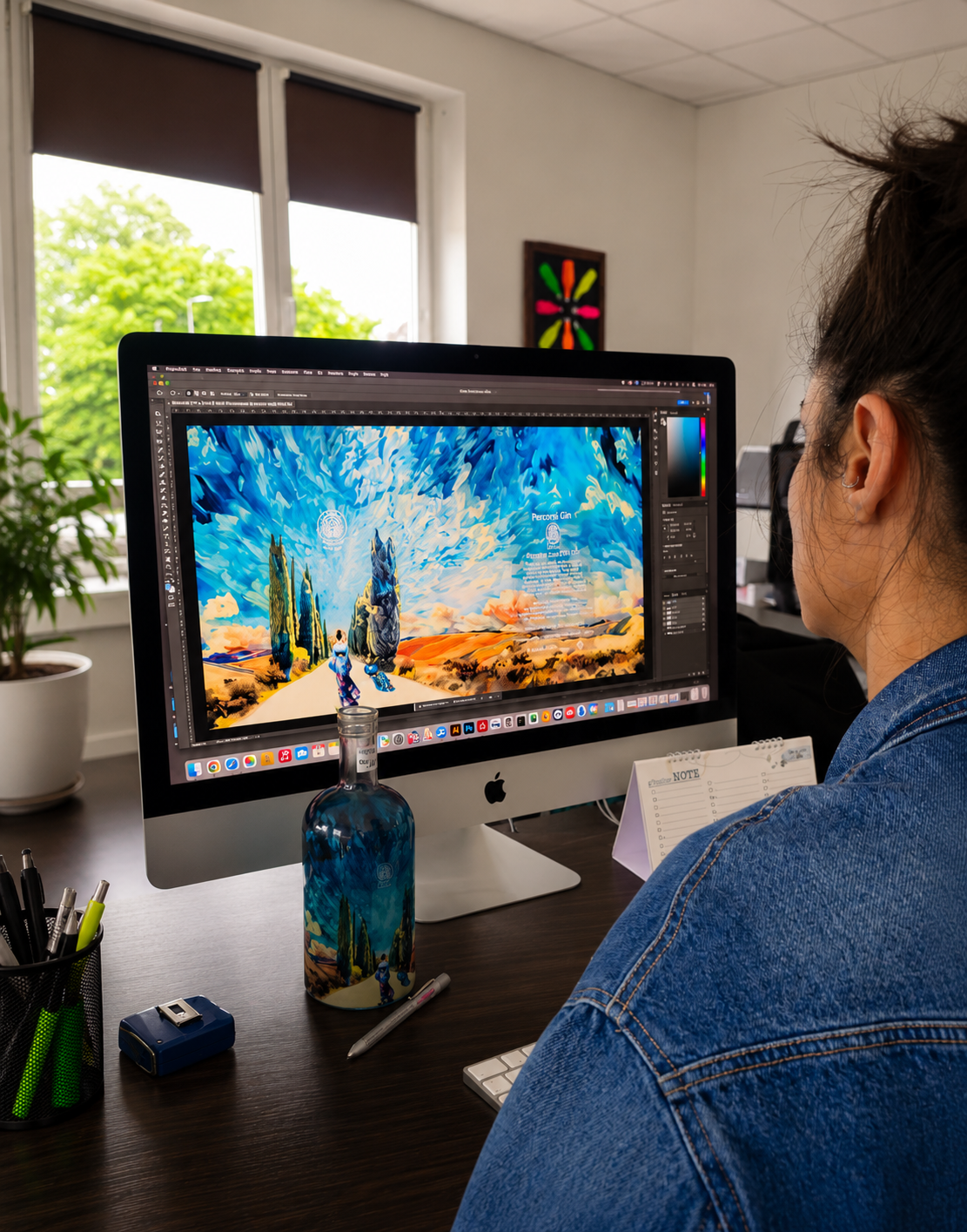
Before partnering with P&P Promotion, Peacock Tuscany evaluated several proposals that failed to fully capture the brand’s character. “Many solutions were technically sound, but they didn’t transform the bottle into a storytelling element“, observe Cecere Palazzo and Piccini. “They lacked the memorable impact we were looking for“. The turning point came when P&P Promotion began working on the technical development and adapting the artwork to the bottle’s surface. The process started with the original illustration created by Elena Maria Aiello (Ascolta Visioni), which had to be translated onto glass and developed as a continuous design wrapping around the entire container. The owners wanted to reproduce peacock-inspired colors and gradients on the glass, while showcasing the central illustration and preserving its identity, atmosphere, and visual language. “Trust was essential“, emphasizes Francesca Lorusso, Marketing Manager at the Piedmont-based company. “We developed a solution that required hours of research, experimentation, and investment before we had a final sample to show“. The project, which took about six weeks, involved adapting the image and developing the sections needed to transform it into a seamless composition across the bottle’s entire surface. The elements required to complete the 360-degree design were connected, extended, and integrated where necessary to ensure continuity in the hills, sky, vegetation, and other visual features, thereby maintaining a coherent visual narrative and avoiding a disjointed collage effect.
Non-stop innovation for over 35 years
From the customization of promotional items to specialized glass decoration for the premium beverage sector: this is the journey taken by P&P Promotion, a company founded in 1990 by Paolo Lorusso and now led by the second generation, represented by Francesca and Luca Lorusso. It is an entrepreneurial story built on the ability to identify new opportunities and transform them into distinctive capabilities. As Francesca Lorusso, the company’s Marketing Manager, explains, the business did not originate in the printing world, but rather in the mechanical sector. After working as a sales representative for lithography firms and encountering the screen-printing industry, Paolo Lorusso decided to start his own business; thus, Arte & Stampa was born, initially focusing on promotional items. During those same years, Paola — his future wife — joined the company, and it was from their union that the name P&P Promotion emerged — a name that still identifies the enterprise today. The late 1990s marked a pivotal moment, as the need for greater specialization became apparent. Through his interactions with oenologists and beverage industry professionals, Paolo Lorusso identified decorated glass as a sector with immense potential; he decided to invest in direct-to-bottle printing, purchasing the first production machine from France. At the time, this was considered a risky move, yet it was destined to shape the company’s future. Today, P&P Promotion specializes in high-value-added decoration for wines, spirits, and premium beverages. “Our specialty lies in delivering what the market often struggles to offer” says Francesca Lorusso. “We develop customized projects that combine technical expertise, creativity, and research“. The service portfolio encompasses direct and indirect screen printing, hot and cold processing, special finishes and decorative applications, the patented CMCV® process for coloring glass with vitrified powders, and digital nanotechnology for bottles, alongside the customization of promotional items and traditional digital printing. Research and development lie at the heart of the business: “We often go beyond simply using existing technologies, developing new solutions to achieve specific results“. Today, the R&D department is managing over thirty experimental projects, underscoring a commitment to innovation that has defined the company since its inception.
Graphics, light, and glass engage in a seamless dialogue
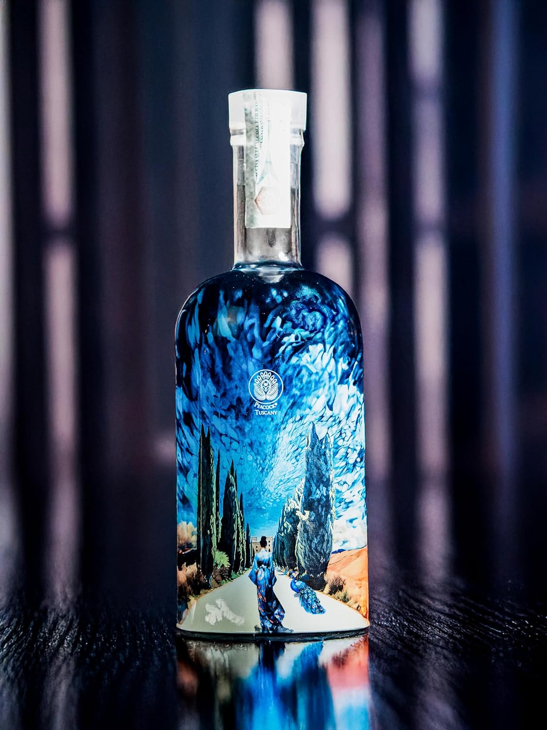
The result is a visual narrative in which elements of the original illustration are integrated with sections developed to extend the composition across the bottle’s entire surface, creating continuity in the landscape, the female figure, the vegetation, and other visual elements.
Non-UV digital nanotechnology
The complexity of the graphic design required a production platform capable of ensuring great expressive freedom; consequently, P&P Promotion utilized a unique non-UV digital nanotechnology — the only one of its kind in Europe. The system allows for the combination of transparent and opaque colors using CMYK and white, creating gradients, depth effects, and levels of detail that are difficult to achieve with conventional methods. One of the most significant aspects is the ability to decorate the bottle’s shoulder as well — an area that is typically challenging to handle in digital glass printing. In this instance, the gradient extends beyond the container’s main body, creating a visual continuity that eliminates any sense of a break in the design. “We wanted to avoid the graphic looking merely applied“, states Lorusso; “the goal was for it to interact with the bottle’s actual shape“. The process involved numerous trials to precisely calibrate opacity, transparency, and color channels. Particular attention was paid to the back of the bottle, where mandatory information was placed against a darker transparent background to ensure readability without compromising the overall aesthetic balance. Furthermore, the resulting surface brilliance enhances the glass’s transparency and accentuates the optical effects created by the liquid contents, transforming a feature often viewed as problematic in the spirits industry into an integral part of the communication design.
Interaction with light, dynamism, and depth
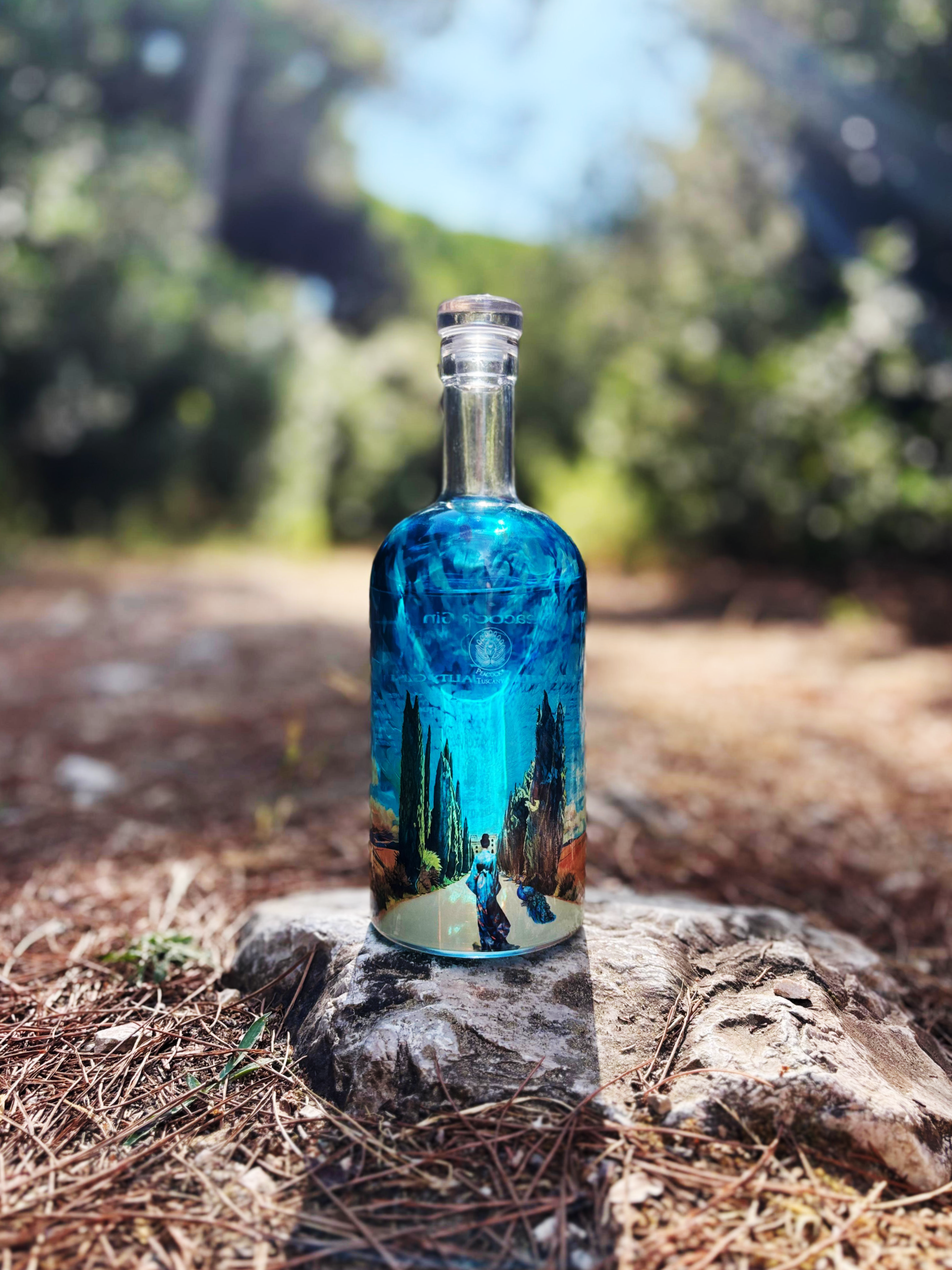
The relationship between the decoration, the glass, and the spirit itself is one of the most fascinating aspects of the design: rather than working against the magnifying effect created by the clear liquid, the development team chose to harness it as an expressive tool. Optical distortions were thus integrated into the bottle’s visual language, altering the viewer’s perception depending on the angle of observation.
When translating the design onto glass, P&P Promotion focused on the technical rendering of the original artwork’s colors and gradients, fine-tuning them to suit the characteristics of the substrate and the decoration process. “We didn’t want to simply copy the peacock’s hues“, explains Francesca Lorusso; “instead, we sought to convey its essence through color transitions that link all the elements on the surface“. In developing the 360-degree design, the sky was also extended and adapted to ensure compositional continuity and seamless alignment with the original illustration.
Symbolically, the Viale dei Cipressi (Cypress Avenue) represents a connection to the botanicals and the Tuscan coastal landscape, while the female figure embodies the gin as it “ventures into Tuscany,” accompanied by the peacock — the “Peacock Tuscany.” According to the founders, the kimono carries an additional meaning: it serves as a reminder that, alongside Mediterranean elements, the spirit incorporates spices from distant lands and diverse geographical regions. “The entire graphic composition was conceived as a system of visual references and allusions that offers a nuanced interpretation of our brand identity, avoiding decorative choices that exist merely for their own sake“.
Internationally recognized technical innovation
The project has played a significant role in establishing brand recognition for Peacock Tuscany. Feedback from distributors, Ho.Re.Ca. professionals, and specialized wine shops indicates that the bottle is now one of the elements most strongly associated with the brand. “It immediately sparks interest and conversation“, reveal Cecere Palazzo and Piccini. “Many professionals view it as a key differentiator, and the contents subsequently live up to the expectations set by the visual presentation“. Consistency between the quality of the spirit and its external presentation is considered essential for competing in the high-end market; hence the decision to use select botanicals and a distillery in the Maremma region, ensuring continuity between the product, the territory, and the visual narrative. Sustainability is also part of the corporate strategy, involving the use of a glass stopper and a partnership with Treedom to create a forest linked to the project’s commercial growth. On the industrial front, the Peacock Tuscany project contributed to the recognition P&P Promotion received at the FESPA Awards 2025, where the company won the Innovation Award for work involving direct printing on three-dimensional products. Regarding Peacock Gin, FESPA Italia specifically highlighted the 360-degree decoration achieved through a new digital nanotechnology applied to glass. “This result was particularly moving for us“, admits Lorusso, “since my father was a founding member of FESPA Italia and always believed in the importance of networking, sharing experiences, and promoting ‘Made in Italy’ globally“. For Peacock Tuscany, this project marks an important milestone, but not the end of the journey: “We are currently evaluating new product lines and special editions“, conclude Cecere Palazzo and Piccini, “including Peacock Gin Santo, which explores aging juniper berries in small casks previously used for Vin Santo“. We aim to consolidate our presence in domestic and international markets, continuing to invest in product innovation and the building of a strong, distinctive identity.
Translating the passion for the Tuscan coast into a bottle
Founded in 2023, Peacock Tuscany is the result of the shared vision of Lorenzo Cecere Palazzo and Daniele Piccini, who chose to enter the spirits industry with the aim of building a project deeply rooted in the local territory. Rather than simply producing a gin, the founders sought to create a brand capable of telling the story of contemporary Tuscany through production quality, a strong sense of place, and meticulous attention to brand image. “From the very beginning, we envisioned a brand that combined craftsmanship, authenticity, and a strong visual identity“, they explain. The choice of gin stemmed from the opportunity to work with botanicals and develop a distinctive aromatic signature while maintaining a strong connection to the region of origin. The territory lies at the heart of the project: landscapes, local culture, and traditions shape both the production philosophy and the brand’s positioning, resulting in a modern offering that blends innovation with references to Tuscany’s rural history. A defining feature of the range is the use of fourteen botanicals, selected to strike a balance between complexity and harmony. “We wanted to achieve an elegant, recognizable profile where balsamic, citrus, floral, and spicy notes coexist seamlessly. We love ensuring that every tasting of Peacock Gin reveals different nuances“. Originality, quality, innovation, and attention to detail guide every business decision — from the selection of raw materials to the development of the brand identity — with the goal of establishing a recognizable presence in the premium spirits segment.
Elena Maria Aiello, founder of Ascolta Visioni, is a graphic designer and illustrator specializing in branding and packaging, with particular expertise in the beverage sector. Her work intertwines graphic design and original illustration to create narrative visual identities, where images, characters, and atmospheres become integral to the product’s character and the brand’s story.