In the premium spirits world, where the number of products continues to grow and competition often plays out in the seconds before a purchase is made, packaging is taking on an increasingly strategic role. This is the context for the project developed by P&P Promotion for Peacock Tuscany, a young company founded in 2023 by Lorenzo Cecere Palazzo and Daniele Piccini with the goal of creating a gin strongly characterized by its connection to Tuscany and an image capable of standing out on shelves without resorting to the category’s more traditional codes. The first production arrived in July 2024, but the process of defining the visual identity began several months before the launch. “Today, packaging represents the first point of contact between the consumer and the product,” explain the founders of Peacock Tuscany. “On a crowded shelf, a bottle must be able to capture attention in a few seconds, but at the same time it must be able to tell its own story. For us, it’s not just a simple container, but an integral part of the brand experience.” The intention was to create a sophisticated, contemporary, and instantly recognizable image, consistent with the product’s super-premium positioning. Peacock Gin, crafted with fourteen select botanicals, was born from the idea of combining local tradition, research, and attention to detail. To stand out in an extremely competitive market, however, two complementary elements were needed: a spirit capable of expressing its own personality and a graphic design capable of communicating this identity even before tasting, maintaining credibility and prestige. From this requirement, a project took shape, requiring an unconventional creative and technological approach, founded on the desire to transcend the limitations usually associated with glass decoration.
Six weeks for the graphic reconstruction
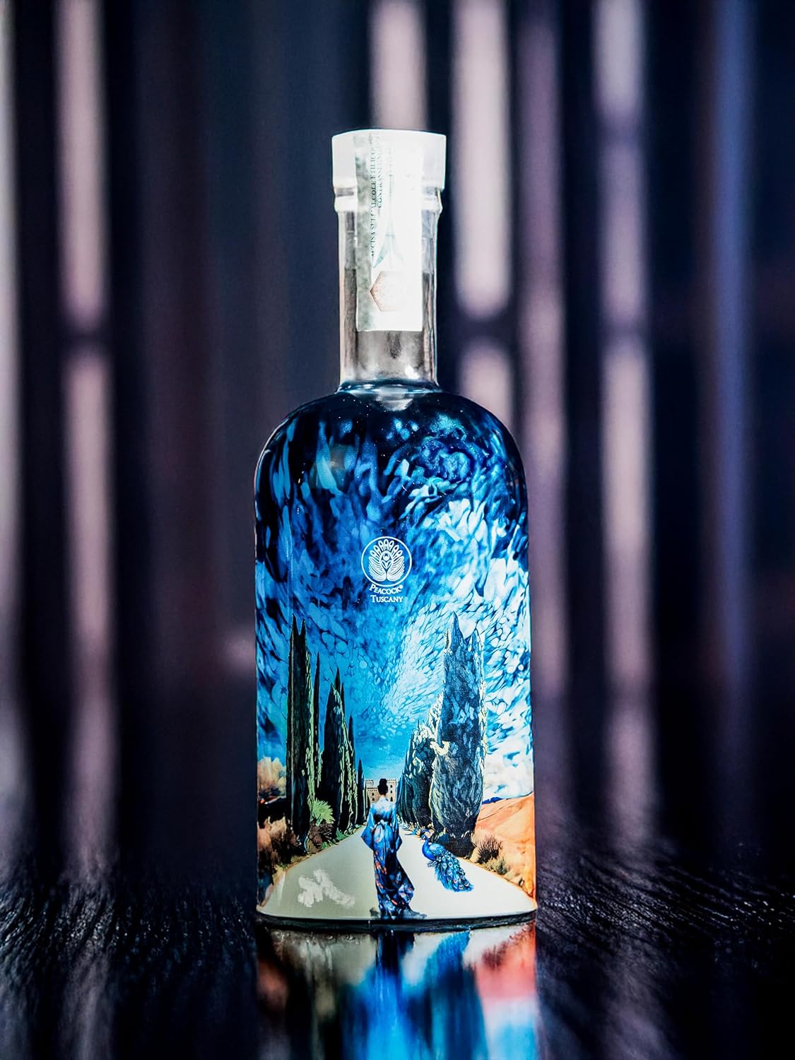
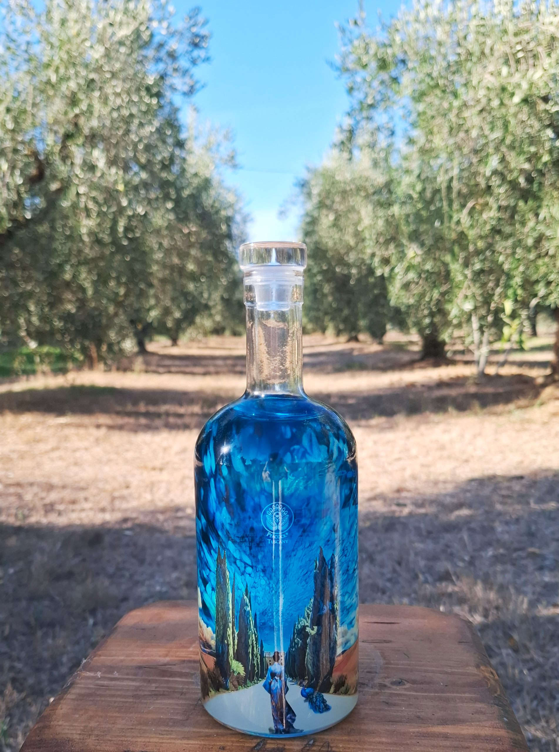
Before meeting with P&P Promotion, Peacock Tuscany evaluated several proposals, but none fully captured the brand’s character. “Many solutions were technically sound, but they didn’t transform the bottle into a narrative element,” observe Cecere Palazzo and Piccini. “The memorable effect we were looking for was missing.” The turning point came when P&P Promotion requested complete design freedom. This wasn’t a foregone conclusion, considering the project’s starting point was a small, low-resolution painting depicting a female figure and some trees. The owners wanted to reproduce the peacock-inspired colors and shades on glass, while also showcasing the central artwork. “Trust was key,” emphasizes Francesca Lorusso, Marketing Manager for the Piedmontese company. “We developed a solution that required hours of research, experimentation, and investment before having a final sample to display.” The work, which lasted approximately six weeks, consisted of completely reconstructing the image and transforming it into a continuous composition capable of extending across the entire surface of the bottle: hills, sky, vegetation, and characters were redrawn and integrated into a coherent visual narrative, designed to accompany the gaze across the entire 360-degree view of the glass. Each element was designed to interact with the others, avoiding a collage effect that would have compromised the overall balance. The result is a visual narrative in which the Tuscan landscape, the female figure in a kimono, the peacock, the sky, and its nuances become components of a single scenography, constructed to be observed from different perspectives and progressively reveal more details.
Non-UV nanotechnology digital technology
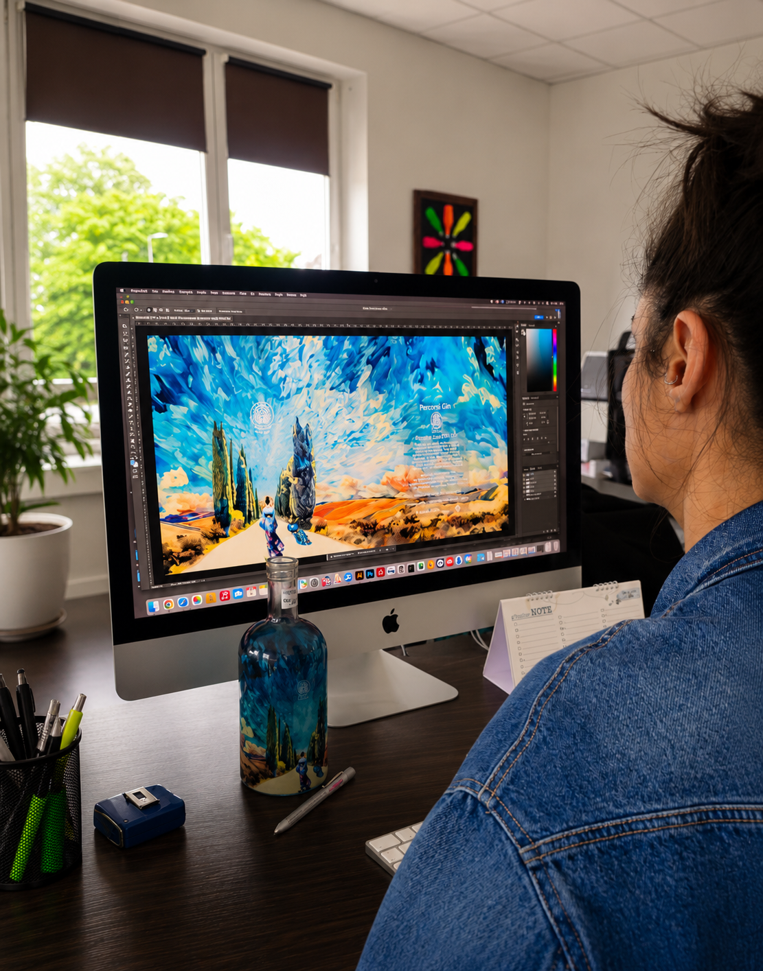
The complexity of the graphic design required a production platform capable of ensuring a high level of expressive freedom, which is why P&P Promotion employed a non-UV digital nanotechnology unique in Europe. The system allows for the combination of transparent and opaque colors through the use of four-color process and white, generating gradients, depth effects, and levels of detail that are difficult to achieve with conventional methods. One of the most significant aspects is the ability to decorate the shoulder of the bottle, an area typically complex to manage in digital glass printing. In this case, the gradient continues beyond the main body of the container, helping to create a visual continuity that eliminates any perception of interruption in the decoration. “We wanted to avoid the graphics looking like they were simply applied,” says Lorusso. “The goal was for them to interact with the shape of the bottle itself.” The process required numerous tests to correctly define opacity, transparency, and color channels, and particular attention was paid to the back, where the mandatory information was placed on a darker transparent background to preserve legibility without compromising the overall aesthetic balance. The resulting surface shine also enhances the transparency of the glass and helps emphasize the optical effects generated by the liquid content, transforming a characteristic often considered problematic in the spirits world into an integral component of the communication project.
Interaction with light, dynamism and depth
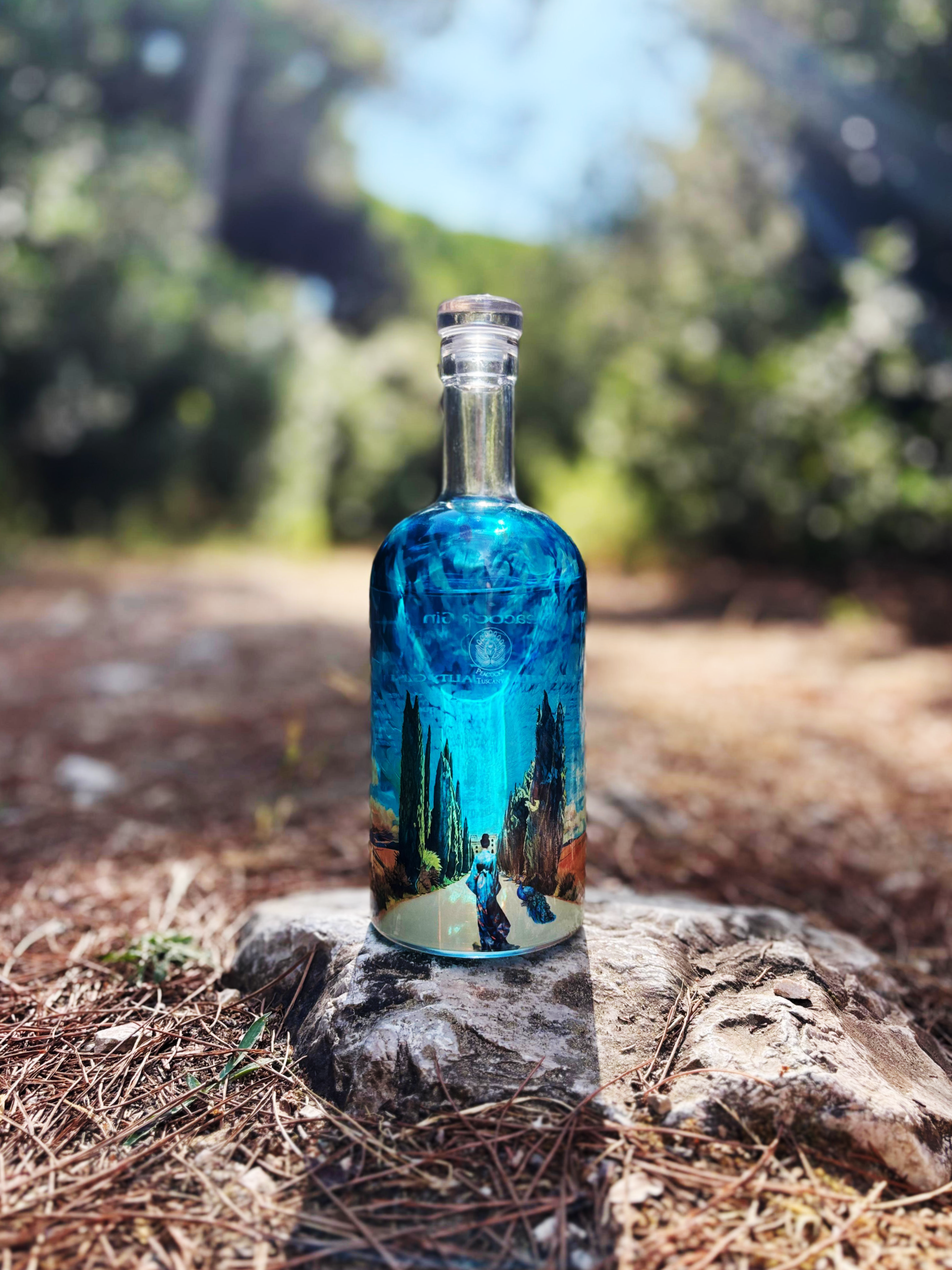
The relationship between decoration, glass, and spirit is one of the most interesting aspects of the project: rather than counteract the lens effect produced by the transparent liquid, the development team chose to exploit it as an expressive tool. Optical deformations were thus integrated into the visual language of the bottle, which changes perception depending on the angle of observation. The colors inspired by the plumage of the peacock, the company’s symbol, are not limited to a simple aesthetic reproduction, but become the common thread of the entire composition. “We didn’t want to copy the peacock’s hues,” states Francesca Lorusso, “we tried to convey its essence through chromatic passages that connected all the elements present on the surface.” Even the sky was designed from scratch, with brushstrokes capable of simultaneously recalling the original work and the iridescence typical of the animal’s feathers. Symbolically, the Cypress Avenue represents the connection with botanicals and the Tuscan coastal landscape, while the female figure ideally represents the gin “entering Tuscany,” accompanied by the peacock, representing Peacock Tuscany. According to the founders, the kimono takes on a further meaning: it recalls that alongside Mediterranean elements, the spirit also features spices from distant lands and diverse geographical areas. “The entire graphic design was conceived as a system of visual references and allusions that provides a comprehensive interpretation of our brand identity, avoiding purely decorative solutions.“