
Friol, a well-known brand of frying oil produced by Deoleo, has revamped its packaging with the aim of presenting a new, more modern and striking visual identity to consolidate its expertise as a specialist in the world of frying oils.
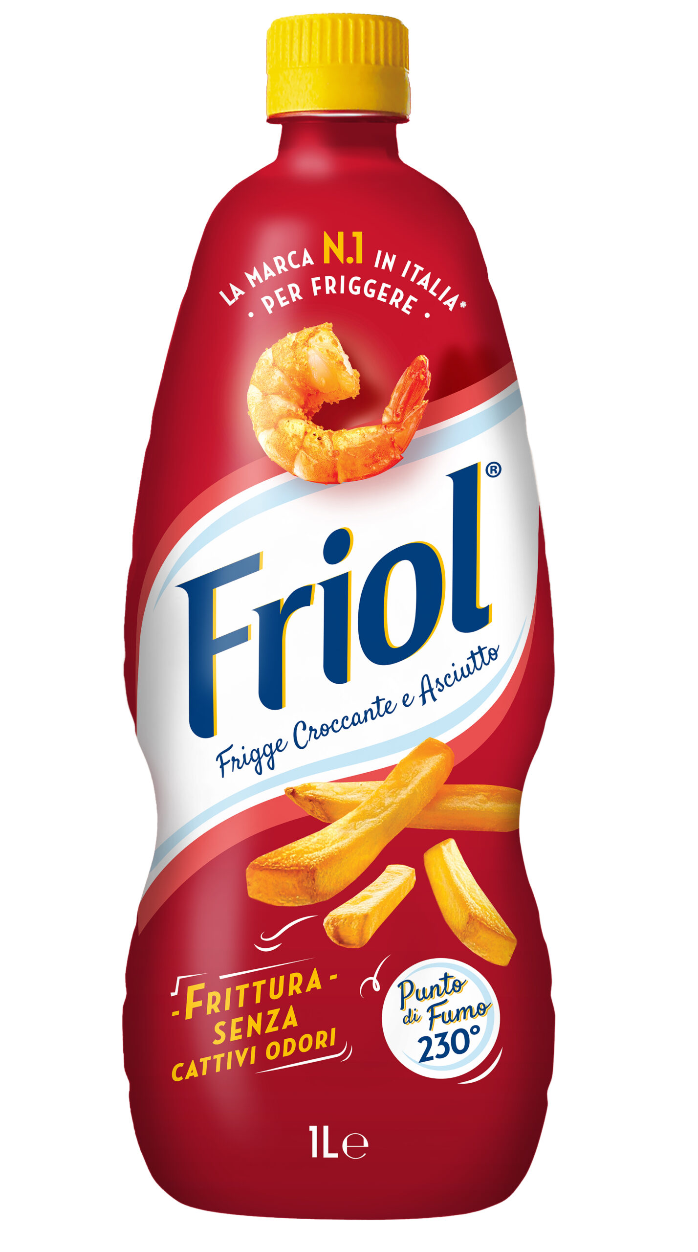
‘The new image,’ summarises the brand in a statement, “highlights the benefits of the product and the advantages of the formula, increasing shelf visibility and brand recognition. At the same time, it supports Friol’s premium positioning, making the perception of quality, performance and expertise, which have always been the pillars of the brand, more evident. The restyling does not break with the brand’s historical identity and colours, focusing instead on graphics and messaging to make the brand promise immediate and distinctive.”
The relaunch project stems from the results of the Ipsos Fast Fact ‘Consumer Test Seeds’ survey, conducted in April 2025, which revealed that when consumers choose an oil for frying, the key factors are crispy, non-greasy frying results, the absence of unpleasant odours and a high smoke point.
Going into more detail about the restyling project, Friol reaffirms its role as Italy’s number one brand for frying, communicating value, reliability and experience. The iconic logo has also been given a more modern look and the product visuals have been updated, giving the prawn and chips a more contemporary and appetising graphic design, reinforcing the promise of high frying performance. Two of the characteristics that guide consumers’ purchasing decisions, according to Ipsos research, have also been highlighted: “Smoke point 230°” and “Frying without unpleasant odours”.
Even the back of the bottle becomes an integral part of the storytelling, providing detailed information on benefits, methods of use and expertise, to guide consumers in their choice and user experience.